
The colors you use on your giving and registration forms can have a huge impact on your constituents.
Color communicates.
- Color influences human emotions through a series of signals triggered by the hypothalamus.
- The human brain processes images quicker than text.
- Color can affect how your school's brand is remembered.
Most importantly for advancement offices: Using the right colors can motivate form users to action.
In this article, you're going to learn the basics of color psychology and how to use color to increase the conversion rates of your giving and event registration forms.
What Is Color Psychology?
Action colors are colors used strategically in forms and interfaces to shape emotion and prompt a specific user action, such as clicking a button, continuing to the next step, or completing a submission. Color psychology is the field of research that studies the mental and emotional effects of colors on sighted people, which is why action colors matter to web designers, marketers, and institutions trying to increase engagement, improve form conversions, and keep the experience aligned with their brand.
While some aspects of color psychology are subjective — we don't all react the same way to colors — studies have found substantial evidence of its influence on our understanding and decision-making. Here, we'll look at the basics of color psychology, how form colors can support brand identity, what specific colors and color combinations tend to signal emotionally, how contrast affects readability and response, and which best practices — including accessibility checks and A/B testing — help you choose colors that move users to act.
(Note that the definition of color psychology specifically references sighted people. In our article on accessibility, we warned that using color or contrast to convey meaning could cause problems for vision-impaired and colorblind users. So, in this article, we're going to focus on moving people to action emotionally — not giving color-based instructions, which we strongly discourage.)

How to Use Color Psychology to Communicate Emotions on Your Forms
First and foremost, your form colors should align with your institution's brand colors. This consistency supports brand identity, and consumers judge products within 90 seconds based on color alone. Too many clashing colors can leave the impression that your form isn't a legitimate part of your institution's content — creating friction for users and possibly calling into question the form's validity.
Build other color elements on top of this foundation of brand alignment.
Now, think about how you want the user to feel. Examples include …
- Excited (as in enthusiastic about an upcoming athletic or alumni event)?
- Moved (as in impassioned about supporting a cause)?
- Angry (as in infuriated about an issue your institution is working to fix)?
Let that key emotion drive the rest of your color choices while you're building your form.
While specific color connotations vary across audiences, your target audience and its cultural background can also shift those meanings. In Western culture, there are some general commonalities in how we interpret color meanings:
- Red: Passion, anger, aggression, emergency; it can create a sense of urgency and is common in clearance messaging and cta buttons.
- Orange: Happiness, joy, ignorance.
- Yellow: Joy, intelligence, sunshine, caution (often chosen for its bright, attention-grabbing optimism).
- Green: Healing, harmony, safety, money, growth. In some industries, it also signals specific positioning, such as eco.
- Blue: Peace, trust, tranquility, sadness.
- Purple: Luxury, spirituality, femininity, sometimes sadness.
- White: Purity, cleanliness, coldness.
- Black: Formality, modern, death.
When Dr. Andrew Elliot conducted a study at the University of Rochester on the effect of color on cognitive task performance, it was discovered that simply putting a red border around a photo could influence how attractive a stranger perceived the person in the photo to be. Could this be because in the West, red is the color of passion and romance? Psychologists think so.
Colors Interact With Each Other
Different colors interact with each other differently, convey different feelings, and communicate certain messages. Think about these combos: black and white, orange and brown, and pink and green. You don't need to see swatches to know that they will feel completely different.
While color and color combinations can certainly influence your form users in positive ways, too much color can be off-putting. Web page design experts recommend a simple three-color strategy, essentially a version of the 60-30-10 rule:
- A main color for the majority of the page—the neutral base.
- A second color that complements the first, to bring visual emphasis to areas of the page—the secondary color.
- A third, brighter color that doesn't clash with the first, to be used only for action colors, creating visual hierarchy.
Let's take a moment to talk about the word “complement.” Here we don't mean “looks nice.” A complementary color is the opposite color on the color wheel, and it naturally stands out to the human eye. This is why call-to-action colors draw immediate attention and help guide users toward primary goals.
For example, red is the complementary color to green. If your main form color is green, using red on an area of the page will bring attention to that area of the page, and contrasting backgrounds make it more effective. This is often called the “isolation effect,” where something that stands out from the norm is more memorable.
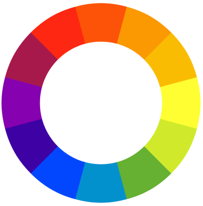
Use complementary (or contrasting) colors on important elements such as donation buttons, with orange as a popular choice for its energetic feel, to bring visual attention and increase conversion rates. Sessions College offers a free color calculator you can use to choose harmonious color combinations.
Color Contrast Affects Readability
While the readability of your form relies mostly on the fonts you choose, color contrast can make a big impact, too, and careful contrast improves clarity for users with visual impairments. If your font doesn't contrast enough with the background color, it can be hard for even the most eagle-eyed user to read.
Studies have found that red buttons earn more clicks than green buttons (HubSpot found a 21% increase in clicks when they ran the test, in fact) — but this isn't necessarily because red is a more action-oriented color. Red often contrasts more with the other page elements, thus standing out more on the page. High-contrast buttons tend to outperform buttons that blend into the background, so the winning CTA color is usually the one that doesn't use the same color cues as the overall design.
Look how The American Prospect uses contrasting color to bring attention to the different donation amounts:
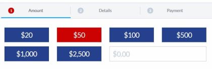
When UK airline BMI added a red background to their CTA — without changing anything else — conversions increased by 2.5%.
All of that said, remember that some people can't see colors at all. Colorblindness is more common than you might think. Don't rely on color alone to give visitors direction on the page, especially for people with visual impairments, since text and labels add clarity. For example, don't use red font to indicate required fields.
There is a whole spectrum to colorblindness, actually, that you must take into consideration when building forms online. While some colorblind people can only see in black and white, some can see certain colors and not others. Mark Zuckerberg, creator of Facebook, is red-green colorblind.
Red and green actually pose the biggest problem to colorblind people across the spectrum. They are incredibly hard for most colorblind people to differentiate. So once again, don't rely on colors to instruct your form users. Use text to provide information.
Color Is Powerful for Brand Identity — but Color Preference Isn't Universal
While there are no universal rules for call-to-action colors, a change of colors alone can improve your form conversion rates, and what works depends on context, conditioning, and your target audience. Color associations vary across regions, cultures, groups, and individuals. Some experts believe that responses to color stimuli may even be evolutionarily ingrained.
The best thing you can do for your users and your conversion rates is to A/B test cta colors and combinations. The heavy lifting comes from understanding the audience, the service, and the landing page context rather than just swapping one shade for another. Once you find an effective brand color, use it consistently across the page and related experiences to signal interaction and strengthen recognition; consistent color usage can increase brand recognition. Use what works, and avoid what doesn't.
Use the guidelines and tips in this article as starting points, but plan to experiment with your own constituent base to find out what works best for them. Other colors can work when they fit your brand palette and are tested in context rather than chosen by trend.