Is everyone who wants to donate to your school online able to do so?
What about those who want to register for events? Can everyone access, use and submit the forms on your website?
If your giving forms aren’t compliant with accessibility standards, the answer to those questions might be a firm “no.”
According to the 2016 Disability Statistics Annual Report, The American Community Survey (ACS) estimates that 12.6% of the U.S. population is disabled. This includes visual, auditory, physical, speech, cognitive, language, learning, and neurological disabilities — all of which may impact the way people view and use content on the web.
This post is going walk you through a brief introduction to web accessibility, and then dive into four major things you should watch out for when creating forms for your advancement activities.
A Brief Introduction to Web Accessibility
First, a quick introduction to accessibility standards and laws that may impact your advancement office’s web content.
The most important guidelines are defined by the Web Content Accessibility Guidelines (WCAG) 2.0 recommendations report. Though nothing can make the web accessible to 100% of people with disabilities, these guidelines address the needs of the widest range of people, including older individuals with changing abilities due to aging. Considering the largest group of givers is Baby Boomer alumni, following these guidelines can make a big difference when it comes to meeting your annual dollar goals.
Section 508, an amendment to the U.S. Workforce Rehabilitation Act of 1973, is a federal law that mandates certain accessibility standards for any web content that may be used by the federal government. This applies to many higher education institutions, so it’s an important law to understand and — if your school falls under its mandates — comply with.
Just this year, Section 508 requirements were updated to mirror WCAG 2.0, Conformance Level AA. So the good news is that if you follow those WCAG 2.0 recommendations, your web content is likely also compliant with Section 508.
If you’d like a more detailed information about the WCAG 2.0 Conformance levels, you can find the requirements here and a handy checklist here.
Forms present additional challenges to disabled users
Forms can be especially challenging for users with vision impairment, mobility impairment, or cognitive or learning disabilities.
Assistive technology (AT) such as JAWS or Window Eyes screen readers can help — as can using a keyboard instead of a mouse to navigate — but only if the form is well-made. Both assistive devices move sequentially down a form, so the way the form is designed directly impacts assisted users’ ability to navigate, fill out and submit them.
Click for a real-life example: Use only your keyboard to complete the form on this page. Pay particular attention to how your cursor moves through the third section.
There are four major things to focus on when ensuring your giving and event registration forms are accessible to disabled constituents …

Major Accessibility Challenge 1: Form Layout
When designing a form layout, visual aesthetics are usually the first thing we think about. Unfortunately, many of the elements people use to make a form beautiful make it unusable for a portion of your constituent base.
Using tables is an easy way to make your form look neat and tidy. But remember, screen readers translate content in the order it appears in the source code. If the labels and related form elements are separated, this will cause issues.
To be understood by someone using a screen reader or keyboard, form fields must appear in the order in which they should be completed. Related form fields must also be grouped together in order for AT users to understand how different fields are related.
Major Accessibility Challenge 2: Labels
Screen reader users typically navigate forms using the Tab key on their keyboard. As the user lands on each form control, the screen reader reads the form label aloud. Using labels properly in your form is absolutely critical for these users to understand what content they’re looking at.
- Each input field must include a label.
- Keep labels simple to read, because users of voice recognition software can select the control by speaking its label.
- When a symbol such as an asterisk is used to indicate that a field is required, the symbol must be explained.
- For graphic buttons, include the label in the image’s alt text.
- Any non-label text between form controls will usually be skipped over by AT. Make sure any important instructions are included before the form or in associated labels.
Major Accessibility Challenge 3: Keyboard Accessibility
As previously mentioned, it’s important that your form can be navigated using only the keyboard. Unfortunately, JavaScript and some interactive page elements (e.g. drag-and-drop question types) can cause problems for keyboard users.
As a rule of thumb, to keep your form accessible, keep it simple.
That said, even radio buttons can pose frequent challenges for disabled users. In order for the user to tab through the radio buttons and make their selection, each radio button in a group must have the same attribute.
Major Accessibility Challenge 4: Color and Contrast
Many vision-impaired users, including colorblind users, will not be able to identify colors on your form. Avoid using color or contrast to convey meaning.
If you must use contrast, however (such as for a pie chart), WCAG 2.0 recommends at least 4.5:1. Use a tool such as the Colour Contrast Analyser from The Paciello Group to check your colors before hitting the publish button.
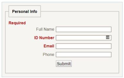
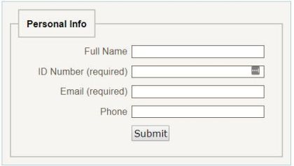
Oregon State University gives this great example of inaccessible, color-focused form controls versus easily accessible form controls:
In the inaccessible form, the user is told that the labels in red are required. A user who can’t differentiate colors would be unable to identify the required fields.
In this accessible form, the required fields include the word “required” next to them — easy for screen readers and colorblind users to read clearly.
Designing Forms for Users of All Abilities
Simple changes to your web forms will ensure they are accessible to as many users as possible. To see some of these changes in action, check out this before-and-after:
After: Form updated to accessibility standards
At Advancement Form, we take accessibility seriously. Our form-building software is built to the most modern accessibility standards, so advancement offices never have to worry about the usability of their forms.
However, Advancement Form is also completely customizable — and some HTML elements (colors, for example) are not WCAG 2.0 or Section 508 compliant. So it’s still critical to understand these guidelines and keep them in mind when building and customizing forms.
In a future blog series, we’re going to go in-depth on the four principles of web accessibility. This series will help you with every aspect of your online fundraising — from your foundation’s website to your multimedia content. However, the forms your constituents use to make donations and register for events have the most direct impact on your annual giving numbers, so we wanted to make sure we got you this information first and foremost.